The editor interface
Open a project and you land on the canvas. Everything sits around the edges: a toolbar across the top, a small control stack in the bottom-left, panels on the right, and the Timeline underneath when you need it.
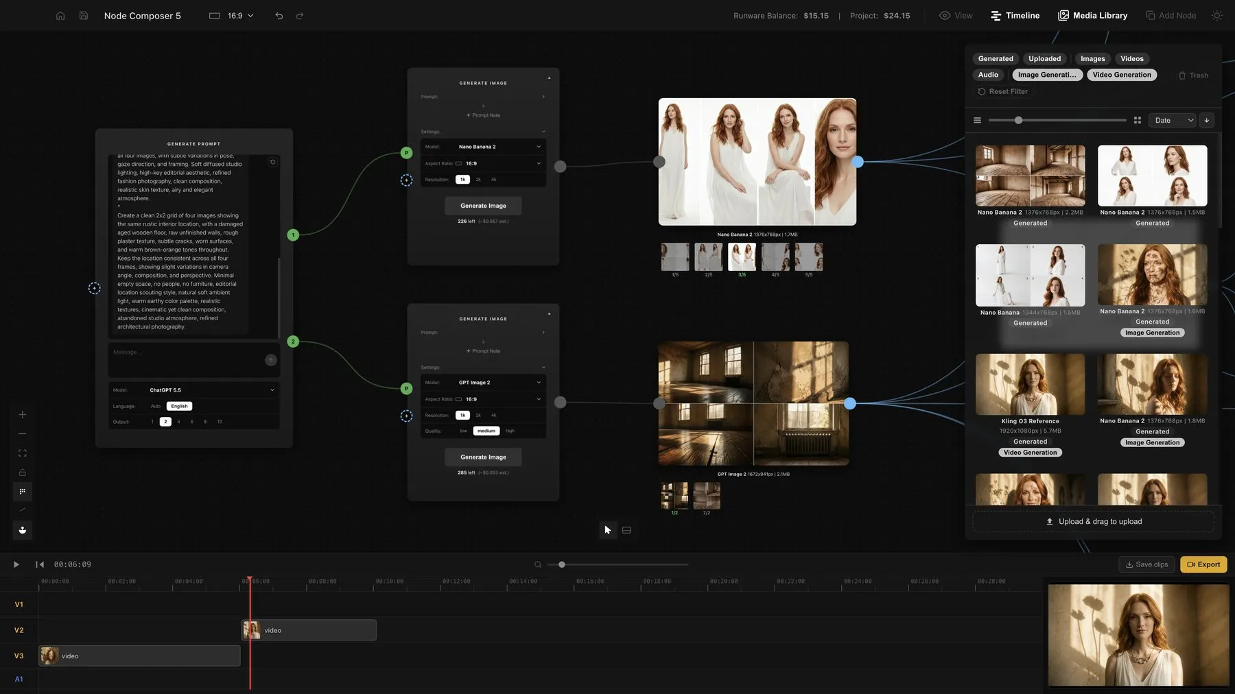
The toolbar
On the left: Home (saves and returns to the Project Library), Save project, the project’s Aspect ratio (every new generator you add inherits it), and Undo/Redo.
On the right: a balance readout showing what’s left on your provider account and what this project has cost you so far, followed by four toggles — View (a floating preview window), Timeline, Media Library, and Add Node. Media Library and Add Node share the same panel, so opening one closes the other.
Canvas controls
A small stack in the bottom-left gives you zoom in, zoom out, Fit view (frames everything on the canvas), a lock to browse without editing, a grid toggle, an edge style switch (curved or right-angled wires), and Group Output, which — when on — collects multiple results from one generation into a single carousel instead of scattering them across the canvas.
Next to that, you can switch between mouse mode (scroll to zoom) and touchpad mode (two-finger pan, pinch to zoom).
Add Node panel
Docked on the right, organised into four sections: Generate (Image, Video, Avatar), Input (Media Placeholder), Prompt (Prompt Generator, Text Area / Log, Prompt Split), and Tools (Image Upscaler, Frame, Text). Click a row to drop it at the centre of your view, or drag it to place it exactly where you want.
Project Media Library
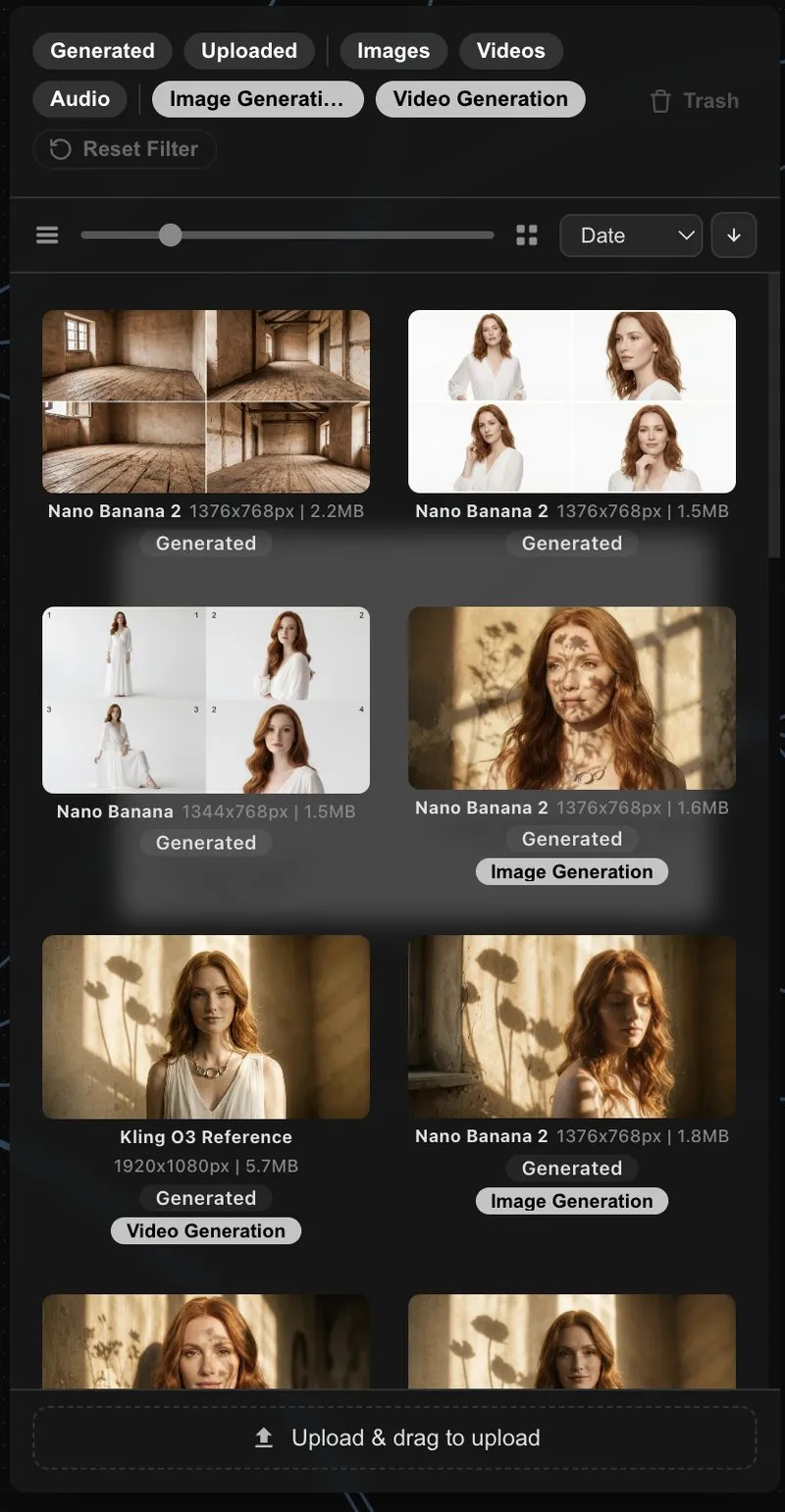
Every file your project has produced or brought in, newest first. Filter chips at the top let you narrow down by favourites, what’s generating, generated vs. uploaded, or by media type. Click an item to select it, double-click to open it in Preview, or drag it onto the canvas or Timeline. Deleting a node never deletes its file here — the library keeps the durable copy.
Preview
A floating window that shows whatever’s selected: a full image editor for images, a player for video and audio, or a full-size text editor for a prompt node. Open it from the View button, a node’s eye icon, or by pressing Space with something selected.
Timeline
Four tracks — three for video, one for audio — with a scrubbable ruler and a monitor on the right. Drag media onto it from the canvas or Media Library, trim clips by their edges, and use Export to render the whole thing into a single video file.
Selecting and arranging
Shift-drag to box-select multiple nodes. With two or more selected, an alignment toolbar appears above them for lining things up, distributing spacing, or arranging in a grid. The same toolbar has Create Frame, which wraps your selection in a labelled backdrop — purely visual, and different from Group N nodes in the right-click menu, which actually merges media nodes into one carousel.
Keyboard shortcuts
The essentials: ⌘Z / ⌘⇧Z to undo and redo, ⌘C / ⌘V to copy and paste nodes, ⌫ to delete a selection, Esc to clear it, Space to open the Preview (or play the Timeline, if it’s open), and ⌘T / ⌘W for new and closing tabs.
Dropping files in
Drag images, video or audio from Finder straight onto the canvas and each becomes its own node. Drop one onto an empty Media Placeholder or generator output to fill it in place, onto a Media Group to add it as a new item, or onto an existing image or video node to combine them into a group. Drop it anywhere else, and it lands as a new node right where you dropped it.